Charting a Shorter
Path to Value
Disco is a network of premium direct-to-consumer (DTC) brands that work together to help consumers discover new brands and products that compliment the ones they already know and love.
Most of the value for Disco's customers is driven by a post-checkout widget called DiscoFeed that promotes complimentary brands to online shoppers. One big hurdle for brands joining Disco is that DiscoFeed can take up to 30 days to get up and running.
Company
Disco Network
Role
Product Designer
Timeline
April – July 2023

Disco Home provides immediate value to brands that join the network
Problem
Disco's core product – DiscoFeed – is a widget the promotes complimentary brands and products to online shoppers after they've just made a purchase from a participating store. To determine which brands to show and in what order, Disco uses an algorithm that accounts for customer overlap, order amount, and many other factors.
For brands that are new to the network, working their way into the algorithm and appearing on partner brands' stores can take up to 30 days – sometimes even longer. This made it difficult to prove the value of the network to new customers, and it resulted in long, complicated sales cycles.
For new brands to feel confident in their decision to join the network, we needed to provide more immediate value.
Research Phase
Strategy Overview
We wanted to find new opportunities to provide value to Disco brands fast, so we conducted a few brainstorming sessions with different internal teams including Product & Engineering, Customer Success, and Growth.
Our goal was to align on the most compelling and realistic ideas, rapidly turn them into prototypes, and get them in front of users and internal stakeholders for fast feedback.
From there, we'd iterate and begin the process again until we landed on something users were excited about.

PROCESS SUMMARY
Ideate
The major theme that won the most support from our brainstorming sessions was using the data Disco had from our network of brands to provide users compelling, actionable insights.
Current customers loved the quarterly reports that we were already giving them, and we thought we could aggregate this data across all brands.
The next step was to figure out the best way to surface this data in the product.
Performance data we were currently sending to individual brands
Prototype
During this process, we found that not only could we aggregate data from current brands, but we could also quickly pull in data from new brands when they integrated their stores. This allowed us to explore potentially useful benchmarking metrics.
We also started to lean into the concept of actionability with the data we were showing. It wasn't enough for it to be interesting, we needed to be sure that it gave brands the confidence to take strategic action.
Validate
After sharing early ideas with customers, we learned that the areas they felt were most actionable were:
- Trends among similar brands
- Benchmarking
- Shared customers
Exploring further, we looked at how to show shared customers not just among other brands but also categories and specific products.
Finally, we added an Insights panel that suggested actions users could take based on the report.
I like seeing trends among other similar brands because I can tell whether something is affecting just us or other brands in our vertical.
I would use the shared customer list to see which brands I could potentially reach out to for partnership or co-marketing opportunities.
Final Designs
Our discovery and research process gave us confidence in what data and insights to show and how to show them. As we finalized the design, we wanted to answer the following questions:
- What's the best hierarchy for the data? Should we prioritize the most dynamic data?
- What data and information should be on the top level, and what should be one level down?
- How can we connect this new dashboard to other areas of the product to raise awareness of additional solutions and value?
All of these questions are answered in the final designs below.
1. Benchmarks and trends across the network
In addition to benchmarks and trends from the brand's store (Shopify, in this case), we added the ability to add more sources like Meta ads data.
2. Find out where your audience overlaps with other brands
Audience overlap shows users which brands they share the most customers with. They can also filter this list by category and brand size.
3. Discover audience overlap in categories and specific products
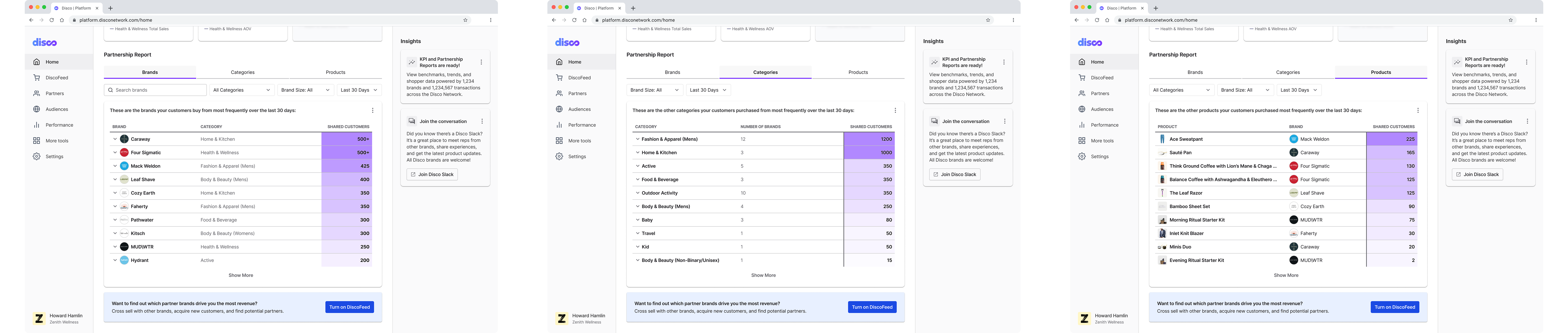
We also show customer overlap by brand categories and specific products.
